Workplace Investing Homepage Redesign
Redesigning the advisor digital experience to bring several disparate homepage experiences under one umbrella and move towards a future vision in which we have one front door for all the audiences we serve
Stakeholders
Product Lead (Employer Digital Experience domain)
Employer Marketing
UX Design
Role
User Experience Research Lead
Problem Statement
Insights derived from previous research with advisors revealed that advisors do not necessarily care about segregation when it comes to public site content (info about products and services, benefits articles and thought leadership, etc.), but that they do prefer to have certain tools and resources in their realm and out of the plan sponsor’s hands (plan benchmarking tool, pricing on plans, requesting proposals).
Given this research, the Employer Digital Experience team had decided to move forward with consolidating the public, plan sponsor-facing site with the public, advisor-facing site to combine content for both audiences into one platform while still providing some level of personalization/segregation of content intended for advisors only.

Goal
The primary goal of this research was to deliver an experience that is simple and easy to understand, easy to navigate and find what you’re looking for, and appeal to what advisors want to learn about and gain access to.
Secondarily, to ensure that in combining the sites and creating a new navigational structure, that we are not adversely or negatively impacting the findability of the content, resources and tools that our users are seeking.

Research Objective
Identify which topics, content and tools are most valuable to advisors when visiting a provider’s website
Determine how best to group the content and resources we make available to advisors by evaluating a proposed navigational taxonomy that represents the future state vision of the advisor experience on the Workplace Investing public-facing site
Key Research Questions
When visiting a provider’s website, what types of information are advisors seeking in particular? What are they looking to do or trying to accomplish when visiting a provider’s website?
How do competitor experiences compare to ours?: Who’s doing it well, and what makes their experience an exemplar?
To what extent do advisors feel the proposed Information Architecture is easy to navigate and organized in a way that is intuitive to them?
Are the menu choices and labels clear and easy to understand?
What content and resources are most valuable for advisors? Are there content gaps that exist in our experience, if any?
Participant Recruitment & Methodology
RECRUITMENT
7 prospective advisors recruited from the Respondent user panel
4 advisor clients recruited from internal advisor panel
METHOD
60 minute 1:1 moderated, in-depth interview and closed card sort exercise in Miro over Zoom
SCREENING CRITERIA
Must be employed, working full-time or part-time
Must be a financial advisor or retirement plan specialist/consultant
Must help employers develop and maintain a company-sponsored retirement plan that meets their needs as part of their role
RESEARCH TOOLS USED


Process
Competitive Analysis

I began by gathering screenshots of IAs for competitor experiences in Miro to:
Gain a baseline understanding of industry standards, best practices, and user expectations
Highlight relative strengths and weaknesses of competitor experience compared to our own
Help facilitate conversations with stakeholders with a visual aid

2. Workshop Co-creation Session
I then led key stakeholders and subject-matter experts through a workshop to collaboratively:
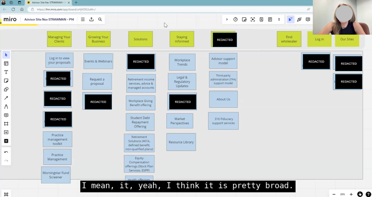
Determine the right top-level (L1) categories and the right parent-child relationships (L2s, L3s) underneath those + labels for each category that are clear and descriptive
Ultimately come away with an artifact that we can test with prospective advisors. The artifact would be a visual representation of the information hierarchy for the Workplace Investing site (advisor experience)
The proposed navigational schema also incorporated insights from previous tree testing of the existing site that provided baseline measurement for findability and identified opportunities for improvement
3. Moderated, Closed Card Sort Interviews with Advisors
I then tested the proposed navigational schema with users over during 1:1 interviews over Zoom
Allowed users to move cards around if they felt they belonged elsewhere, delete cards that they felt were redundant, add cards for content they felt were missing, change labels they felt were unclear or confusing
Invoked think aloud protocol to understand the user’s thought process and rationale
The moderation guide probed around understanding user mental models for the high-level categories (L1s), identified perceived affinities among the cards, and ranked the importance and value of various content categories
Key Findings
Advisors rarely visit a provider’s website just to browse - they are there to do a job. As such, action-oriented items such as tools and advisor-specific resources were unsurprisingly of most value and interest to advisors. Advisors expressed they would want to have a separate section carved out specifically for advisor tools
A category for “Managing Your Clients” was unclear for prospective advisors (who don’t yet work with us). Most users ultimately placed the log-in pages for all our portals under “Log in” in the global header navigation
The “Why Us” section and value prop pieces were of least interest to advisors, who would rather see resources that will help them do a job / get to work (request a proposal, run a quote, find wholesaler, etc.)
A FEW HIGHLIGHTS
MY RECOMMENDATION

Impact
The Public Site team moved forward with site consolidation of the plan sponsor and advisor-facing websites, which was completed in Q4 of 2024
The team created a new category for Advisor tools based on the research findings, as well as an “Events & webinars” L3 category that hadn’t previously existed
The team consolidated all log-ins for the three portals under the Workplace umbrella under one page under “Log in” in the global header nav, based on the research
The Solutions & Insights L1s were kept as overlapping categories for plan sponsors and advisors, based on advisor research that indicated that advisors do not need/ want this information segregated
KPIs/Metrics
Public site management team reported increase in SEO value by moving to the Workplace domain (vs. the previous standalone advisor website that has since been decommissioned)
New advisor homepage in the consolidated site has had more organic traffic in one quarter alone (Q3 2025) than the previous standalone advisor website for Q1-Q3 2024 combined
Saved the team from supporting 10 development maintenance stories from having to maintain two separate sites with overlapping content (~100 hrs @250/hr = $25K)

THE NAV TODAY
Reflections
1.
During the first few interviews, I began to notice that the research participants were not showing as much willingness to change the proposed navigational schema that was presented.
After a few interviews, I decided to pivot and change the methodology to a hybrid card sort, in which I gave them the high-level (L1) categories but asked them to sort the L2 and L3 cards themselves rather than reacting to a proposed structure. This change enabled us to gain more insight into how they would naturally affinitize content into certain categories and why.
While not ideal to change methods mid-way into a project, it was an important lesson in being flexible and agile in order to get the information needed.
2.
Measuring the impact of UXR is not always easy. If I had more time and bandwidth, I would have followed up with more tree testing on the new experience that was implemented to compare against baseline tree testing that was conducted before the card sort interviews.
While the team could measure the change in metrics like organic traffic and SEO, I would have wanted to report improvements in findability and discoverability of content from the user perspective.
THANK YOU, to the entire team for your support on this beginning with Dianne Kim’s diligent and robust research… We couldn't be more pleased with the end result AND we will help our SEO by consolidating down to one site AND eliminate technical debt surrounding the support of two separate sites.” + share-out at the marketing capabilities showcase meeting."
VP, MarTech Solutions & Innovation Lead